How to Turn Visitors into Clients in 2025. Ultimate super conversion guide.
Table of Contents
Introduction
Did you know that the average website converts only 2.35% of visitors into customers? Yet top-performing websites achieve conversion rates of 11% or higher! I’ve spent years figuring out why some websites are money-making machines while others are just pretty digital brochures gathering dust in the corners of the internet. How to turn visitors into clients.
Let me tell you something – having a beautiful website isn’t enough these days. Trust me, I learned this the hard way with my first design agency when we created gorgeous sites that barely generated leads. What a frustrating time that was!
In today’s competitive digital landscape, your website needs to be a conversion machine that works for your business 24/7. I’m going to share the exact strategies I’ve used with clients who’ve seen their conversion rates double and even triple after implementing these principles.
Whether you’re building a new website from scratch or trying to fix an underperforming one (we’ve all been there!), these principles will help you create a high-converting online presence that actually grows your business. No fluff, just practical stuff that works in the real world. How to turn visitors into clients.
Understanding Your Target Audience
I can’t tell you how many times I’ve made the rookie mistake of designing a website based on what I thought looked cool rather than what my client’s customers actually needed. Big mistake! One time, I spent weeks creating this super sleek, minimalist website for a gardening supply company, only to discover their audience was primarily older adults who wanted BIGGER text and MORE detailed product information. Talk about a facepalm moment! How to turn visitors into clients.
Understanding your target audience isn’t just some marketing buzzword – it’s the foundation of a website that converts. Before you even think about colors or fonts, you gotta get inside your visitors’ heads. What keeps them up at night? What problem are they desperately trying to solve? I now spend at least a week researching my clients’ audience before I even open my design software.
The easiest way to start is by creating detailed client personas. These aren’t just demographic details like “women, 35-45” – that’s way too vague! Get specific about their pain points, decision-making processes, and what would make them choose you over competitors. For one of my financial advisor clients, we discovered their ideal clients weren’t just “people with money” but specifically professionals who had recently received large bonuses and were anxious about making smart investment decisions. That single insight transformed their entire website messaging!
Research doesn’t have to be complicated either. Some of my best insights have come from simply talking to existing customers. I remember interviewing a client’s top customers and discovering that what they valued most wasn’t even mentioned on the website! Another goldmine? Looking at reviews of your competitors – both good and bad. People will flat-out tell you what they love and hate, which is pure conversion optimization gold.
Don’t forget to map out the customer journey from first website visit to becoming a client. Different visitors will be at different stages of the buying process, and your website needs to cater to all of them. Some folks are just starting to research their problem, while others are ready to pull the trigger and buy. Your website needs paths for both types of visitors, otherwise you’re leaving money on the table.
Analyzing competitors’ websites has saved my butt more times than I can count. I’m not talking about copying them – that’s a recipe for mediocrity. I’m talking about identifying their conversion strengths and weaknesses. What are they doing well that you could adapt? What are they missing that you could capitalize on? I once helped a local spa completely dominate their market by adding online booking – something none of their competitors offered at the time. Sometimes the simplest additions can make the biggest difference! How to turn visitors into clients.
Crafting a Strategic Website Structure
Let me tell you, I’ve made some epic website structure fails in my day. My worst was probably for my own web design business (ironic, right?). I tried to be all clever with my navigation naming and ended up with links like “Digital Experiences” instead of just plain “Services.” Guess what? No one could find anything! My bounce rate was through the roof, and potential clients were leaving faster than teenagers at a family reunion.
Strategic website structure isn’t about being fancy—it’s about being crystal clear. Think of your website as a physical store. If someone walks in looking for something specific, how many obstacles are you putting in their way? Each additional click is like making someone walk down another aisle before they can checkout. I now follow a simple rule: visitors should be able to find what they need in 3 clicks or less. Any more than that, and you’re just asking them to leave.
Creating intuitive navigation is seriously make-or-break for conversion rates. I learned this lesson when my biggest client threatened to fire me because their stunning new website was getting fewer leads than their old clunky one! The problem? We’d reorganized everything so it made sense to us but was completely confusing to their customers. We quickly reverted to simpler navigation labels, and the leads started flowing again. How to turn visitors into clients.
One approach that’s worked wonders for me is implementing a logical information hierarchy. Start with your most important content (usually your core services or products) and make those the main navigation items. Then organize supporting content underneath. I used to cram everything into the main nav, thinking more options was better. Boy, was I wrong! When I trimmed one client’s navigation from 9 items to 5, their conversion rate increased by 34%. Less really is more when it comes to navigation choices.
Creating clear pathways to conversion is something I’m kinda obsessed with now. Every page on your website should have a job to do in moving visitors closer to becoming clients. I like to ask: “What’s the ONE thing I want someone to do after reading this page?” Then I make that action super obvious. For a recent law firm client, we created content about specific legal problems but always ended with a clear “Book a Consultation” button. Their consultation requests tripled in the first month!
Site architecture isn’t just about humans—it’s about search engines too. I learned this the hard way when one of my earliest client websites completely disappeared from Google after a redesign. Yikes! We’d changed all the URLs without redirects (rookie mistake). Now I’m obsessive about making sure site structure works for both humans and search engines. This means clean URLs, logical categories, and proper internal linking. Speaking of which… How to turn visitors into clients.
Strategic internal linking is like creating breadcrumb trails throughout your website. You’re guiding users through the sales funnel without them even realizing it. On a recent e-commerce project, we added contextual links from informational blog posts to related product pages, and it increased product page traffic by 64%! These weren’t spammy links either—they were genuinely helpful connections between content the user was interested in and products that solved their problems.
The biggest website structure mistake I see? Designing based on what looks cool rather than what converts. I’ve been guilty of this too! Sometimes boring and predictable navigation actually performs better because it matches users’ expectations. Function over form, always! How to turn visitors into clients.
Creating a Compelling Homepage That Converts
Man, I used to think homepages needed to show EVERYTHING a business offers right upfront. Big mistake! I once created this monster homepage for a client with literally every service, testimonial, and team member featured. It was so overwhelming that visitors were bouncing like they’d landed on a trampoline rather than a website. The bounce rate was a horrifying 67%!
Your homepage isn’t an information dump—it’s more like a movie trailer for your business. It should give visitors just enough to get interested and then direct them to the next step. I’ve completely changed my approach over the years. Now I focus on creating an attention-grabbing headline that directly addresses visitor pain points. For a financial planner client, we switched from the generic “Financial Planning Solutions” to “Stop Worrying About Retirement and Start Living Today.” Their lead form submissions increased by 43% from that one change!
The above-the-fold content (what visitors see before scrolling) is prime real estate that can make or break your conversion rates. This is where I used to get way too artsy, using vague imagery and clever headlines that confused people. Now I make sure this section immediately communicates value. What problem do you solve? Why should they choose you? How are you different? Answer these questions right away, and you’ll keep visitors engaged. I typically include a clear headline, a brief value proposition, and an obvious primary CTA button above the fold. How to turn visitors into clients.
Balancing visual appeal with conversion-focused elements is tricky but crucial. I’ve definitely swung too far in both directions before! Early in my career, I’d create these gorgeous, image-heavy homepages that looked amazing but performed terribly. Then I overcorrected with pages that were all buttons and forms but looked like they were designed in 1999. Finding that sweet spot takes experimentation. A good rule I follow now: design should support conversion goals, not compete with them.
When it comes to CTAs, I’ve found that most homepages need both primary and secondary options. Not everyone is ready to “Buy Now” or “Contact Us” the moment they land on your site. I ignored this reality for years and wondered why my beautiful big “Book a Call” buttons weren’t getting clicked. Duh! Some visitors were just starting their research. Now I always include a lower-commitment secondary CTA like “View Our Work” or “Read Our Guide” for those visitors who aren’t quite ready to take the plunge. How to turn visitors into clients.
One thing that’s dramatically improved my homepage conversion rates is adding urgency elements. Nothing creepy or fake, but genuine reasons why acting sooner is better than later. For a tax preparation client, we added a simple “Tax deadline approaching: Only X days left to file” countdown during tax season. Their consultation bookings increased by 64% compared to the previous year! Just be sure any urgency is authentic—fake scarcity tactics will destroy trust faster than anything else.
Designing High-Converting Landing Pages
Landing pages were my nemesis for YEARS! I’d create these beautiful pages that looked impressive but converted about as well as a vegetarian restaurant at a BBQ competition. My first big client landing page disaster taught me a painful lesson—I’d created this gorgeous page for their PPC campaign with stunning images, cool animations, and clever copy. The result? A 0.8% conversion rate and a very unhappy client who’d wasted thousands on ads.
The turning point came when I realized landing pages aren’t about looking cool—they’re about message match and conversion focus. Now I’m obsessive about ensuring there’s perfect alignment between what the ad promises and what the landing page delivers. If your Facebook ad mentions a “Free Home Valuation Guide,” your landing page headline better say “Get Your Free Home Valuation Guide” not some creative variation. I increased a real estate client’s conversion rate from 3% to 11% by simply making sure their ad copy and landing page headlines matched word-for-word!
I’ve become a big believer in dedicated landing pages for specific products, services, or campaigns. Using your homepage as a landing page for ads is like throwing money in a shredder! I made this mistake with my own business for months before I figured out why my Google Ads were costing me a fortune with minimal returns. Now I create unique landing pages tailored to each offer and audience segment. For a recent SaaS client, we created separate landing pages for different industries they served, highlighting industry-specific benefits and case studies. Their trial signups tripled!
When it comes to landing page copy, I’ve completely changed my approach over the years. I used to write clever, creative copy that showed off my writing skills but didn’t actually sell anything. Facepalm! Now I focus on persuasive copy that directly addresses pain points and offers solutions. I start by listing out all the objections a visitor might have, then systematically address each one on the page. For a high-ticket coaching program landing page, this approach increased conversions by 76%. People need their concerns addressed before they’ll convert!
Using directional cues to guide attention has been a game-changer for my landing pages. I remember conducting a user test where people completely missed the main CTA despite it being a big button. Why? There was nothing directing their eyes toward it! Now I use subtle arrows, human gaze direction in photos, or lines that point toward important elements. On an insurance quote landing page, adding an image of a person looking toward the form increased completion rates by 32%. These visual psychology tricks really work!
A mistake I see everywhere (and used to make myself) is having weak calls-to-action on landing pages. Generic “Submit” or “Click Here” buttons are conversion killers! I now spend serious time crafting benefit-focused CTA copy that reinforces what visitors will get. For a financial planning landing page, changing the button from “Submit” to “Get My Custom Retirement Plan” increased clicks by 48%. The button should complete the thought “I want to…” from the visitor’s perspective.
Mobile optimization for landing pages isn’t optional anymore—it’s essential. I learned this lesson when a client called me panicking because their expensive ad campaign was generating tons of clicks but zero conversions. The issue? The landing page looked great on desktop but was basically unusable on mobile. Considering over 50% of web traffic is mobile now, that was an expensive oversight! I now design landing pages mobile-first and make sure forms, buttons, and key information work perfectly on small screens. For one e-commerce client, this approach increased mobile conversions by 37%!
Optimizing User Experience (UX) for Conversions
Let me tell you about my biggest UX fail ever. I designed this super fancy website for a high-end real estate company with all these cool animations, parallax effects, and custom scrolling behavior. It looked AMAZING… on my powerful design computer. Then the client called me in a panic on launch day because the site was taking 15+ seconds to load on most devices and visitors were leaving in droves. Lesson learned the hard way: performance IS user experience!
Speed is absolutely non-negotiable for websites that convert. I used to think a few extra seconds wouldn’t matter if the design was impressive enough. Boy, was I wrong! Studies show that for every additional second your page takes to load, conversions drop by about 7%. That’s huge! I now obsess over keeping load times under 3 seconds, even on mobile networks. For an e-commerce client, we reduced page load time from 6 seconds to 2.8 seconds by optimizing images and implementing lazy loading, and their conversion rate jumped by 23% almost overnight!
Mobile-first design was something I resisted for way too long. I was in love with these complex desktop experiences that just didn’t translate to small screens. Then mobile traffic surpassed desktop for most of my clients, and I had to get with the program! Now I design for thumbs first, making sure navigation elements are easily reachable without awkward stretching or zooming.
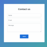
Forms are conversion killers when done poorly. I used to create these massive forms asking for everything under the sun because the client wanted “complete information.” Then I started tracking form abandonment rates and was shocked to discover that 78% of visitors were starting forms but not completing them! Now I’m ruthless about reducing friction points in forms. For a B2B lead generation page, cutting form fields from 11 to just 4 increased completion rates by 120%. If you absolutely must collect more information, break it into multi-step forms where each step feels manageable.
White space is your conversion friend, not your enemy. I used to stuff pages with as much content as possible, thinking more information meant better conversions. Wrong! Cluttered designs overwhelm visitors and make it harder for them to find what they need. I now use white space strategically to guide attention to important elements like CTAs and key benefits. For a SaaS client’s pricing page, we actually removed content and added more breathing room around the primary sign-up buttons. Counter-intuitively, conversions increased by 13%! How to turn visitors into clients.
Feedback mechanisms are crucial for guiding users and confirming actions. I once built a contact form that gave zero indication that anything had happened when users clicked “Submit.” People were clicking multiple times, getting frustrated, and leaving! Now I ensure every important action has immediate visual feedback—buttons change state when clicked, forms show progress indicators, and successful submissions are clearly confirmed. For a lead generation client, adding a simple progress bar to their multi-step form increased completion rates by 28%.
Testing with real users has saved me from countless conversion disasters. I used to rely solely on my “expert” opinion about what would work best. Then I started conducting simple user tests and was humbled by how often my assumptions were completely wrong! For a recent financial services website, I was convinced my navigation structure was intuitive—until I watched five test users completely fail to find the “Open an Account” page I thought was obviously placed. User testing doesn’t have to be fancy or expensive—even testing with 5 people can reveal major UX issues that are killing your conversions.
Implementing Effective Call-to-Actions (CTAs)
Your call-to-action buttons need to stand out like a neon sign in a library. They should visually pop off the page and scream “CLICK ME!” I used to worry too much about buttons clashing with the overall design aesthetic. Now I care more about them getting clicked! For one client, we changed their CTA buttons from on-brand navy blue to a high-contrast orange that didn’t appear anywhere else on the site. Their click-through rate increased by 71% overnight! Sometimes you have to be willing to sacrifice a bit of design harmony for conversion results. How to turn visitors into clients.
The words on your buttons matter way more than most people realize. I used to default to boring button text like “Submit,” “Sign Up,” or “Learn More” because that’s what everyone else did. Then I started testing different CTA copy and was blown away by the results. For a financial planning client, changing their button from “Contact Us” to “Get My Free Retirement Analysis” increased clicks by 43%! Action-oriented, benefit-focused button copy tells visitors exactly what they’ll get when they click, reducing uncertainty and increasing conversions.
Button placement is another thing I totally got wrong early in my career. I used to think one big CTA at the bottom of the page was sufficient. Wrong! I now strategically position CTAs throughout longer pages, especially after introducing compelling benefits or resolving potential objections. For a SaaS client with a long landing page, adding CTAs after each major feature section increased conversions by 28% compared to having just one at the top and bottom. Don’t make visitors hunt for your CTAs!
Color psychology for CTAs is something I used to think was overblown marketing mumbo-jumbo. Then I started A/B testing different button colors and became a believer! While there’s no universal “best” color for all situations, certain colors tend to stand out more against specific backgrounds. For one client, we tested green (their brand color) against red buttons. The red buttons increased clicks by 21% despite not matching their branding! I generally recommend using a contrasting color that stands out from your primary color scheme for main CTAs.
Button design isn’t just about color and size—subtle details like shadows, borders, and hover effects make a huge difference too. I once increased a button’s click rate by 17% just by adding a subtle drop shadow that made it appear slightly raised from the page! These visual cues help signal to visitors that the element is clickable. I now always use hover effects that change the button appearance slightly when a cursor moves over it, reinforcing that it’s an interactive element. How to turn visitors into clients.
Conclusion
Creating a website that converts visitors into clients requires a strategic blend of aesthetics, psychology, and data-driven decision-making. Remember that conversion optimization is an ongoing process—not a one-time project. The most successful websites continuously evolve based on user behavior and performance data.
Start by implementing these foundational principles, then refine your approach based on your specific audience and business goals. With the right design strategy, your website can become your most valuable sales tool, working tirelessly to turn interested visitors into loyal, paying clients. Ready to transform your website into a conversion powerhouse? Begin by analyzing your current site against these principles and prioritize improvements that will have the biggest impact on your bottom line. How to turn visitors into clients.
conversion rate optimization
website conversion tactics How to turn visitors into clients.
user experience design
UX for higher conversions
CTA optimization How to turn visitors into clients.
call-to-action design
persuasive web copy
landing page optimization How to turn visitors into clients.
website conversion funnel
conversion-focused design How to turn visitors into clients.
website trust signals
social proof elements How to turn visitors into clients.
A/B testing websites How to turn visitors into clients.
heat mapping analysis
client acquisition online How to turn visitors into clients.
lead generation website
conversion-centered design How to turn visitors into clients.
website conversion metrics
sales-focused web design
compelling web content How to turn visitors into clients.
form optimization tactics
website visitor engagement
conversion psychology
website persuasion techniques How to turn visitors into clients.
mobile conversion optimization How to turn visitors into clients.
website value proposition
conversion rate benchmarks How to turn visitors into clients.
above-the-fold optimization
strategic website layout How to turn visitors into clients.
customer journey mapping
website analytics for conversions
bounce rate reduction
website friction points How to turn visitors into clients.
micro-conversions tracking
website trust building How to turn visitors into clients.
client testimonial display How to turn visitors into clients.
web accessibility for conversions
page load speed optimization
conversion copywriting
visual hierarchy in web design How to turn visitors into clients.
client-focused web design
website credibility elements How to turn visitors into clients.
conversion-optimized forms
lead capture optimization How to turn visitors into clients.
website usability testing
web navigation for conversions How to turn visitors into clients.
conversion funnel analysis How to turn visitors into clients.
website CRO tools How to turn visitors into clients.
client acquisition strategy How to turn visitors into clients.
FOMO marketing online
scarcity tactics in web design How to turn visitors into clients.
website personalization
conversion-based wireframing How to turn visitors into clients.
How to turn visitors into clients.


